Design Principles (Task 1)
NAME : MYRA ELIDA BINTI ABD AZIS
STUDENT ID : 0358516
GCD60804
TASK 1
INSTRUCTIONS
EXPLANATION
- GESTALT THEORY
- In German, "Gestalt" means shape or form
- Rules that describe how the human eye sees visual elements.
- The aim is to show how complex shapes can be reduced to simple shape. Also, how the eyes see shapes as a single united form than the separate simple elements involved.Fig 1.1
- CONTRAST
- Juxtaposition (the act of placing two or more things side by side often to compare to create an interesting effect) of strong dissimilar elements
- Provide visual interest, emphasise a point and content
Principle of Similarity
- We see similar elements as a complete picture, shape or group even if separated.
- The brain crafts a link between elements with similar nature.
Principle of Continuation
- The eye follows the paths, line and curves of a design and prefers to see a continuous flow of visual elements than those separated.
Principle of Closure
- The eye prefers to see complete shapes. If not complete, the user perceive a complete shape by filling in the missing visual.
Principle of Proximity
- Process of related design elements are placed together and anything unrelated should be spaced apart.
- Close proximity means items connected and become one visual unit which helps to organise to a layout.
Principle of Figure/Ground
- Objects are seen as being either in the foreground or background. Either they stand out or recede into the back.
Law of Symmetry & Order
- This means elements that are symmetrical to each other tend to be seen as a unified group. This suggests that objects that are symmetrical will be likely be grouped together than objects that are not.
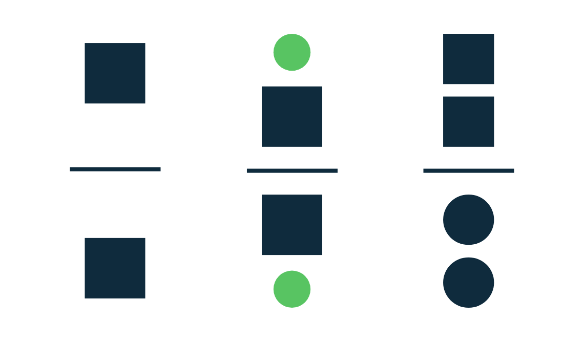
Fig 1.8

Fig 1.8
- EMPHASIS
- To create dominance and focus
- Various elements can be used such colours, shapes or value
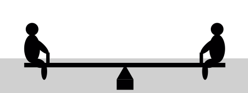
- BALANCE
- Distribution of visual weight in a design
- Visual equilibrium of elements that causes total image to be balanced
- Can be symmetrical or asymmetrical
Symmetrical Balance
- Equal "weight" on each sides of a central fulcrum
- Equal arrangement of the central axis
- Elements are equal around a central point resulting radial balance
- Approximate symmetry means equivalent but not identical forms arranged on the fulcrum line
Asymmetrical Balance
- Unequal visual weight
- One side of the composition has a dominant elements which can be balanced by more lesser focal points on the other side
- Can offer more visual variety which is difficult to achieve due the elements are more complex
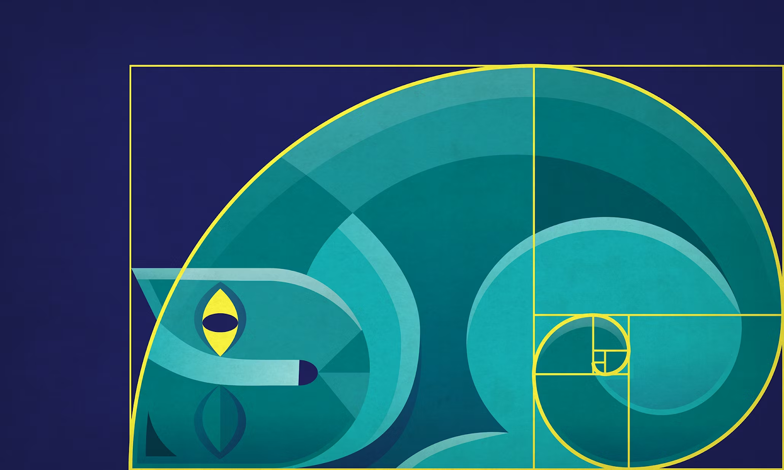
Golden Ratio
- Representative of prefect beauty
- Guide to create visual balance in architecture and paintings
- For designers, can be used to bring harmony, balance and structure also increase the appeal of a design work
Rule of Thirds
- Composition guideline to create more dynamism to a work of design/photography/film/painting
- Image divided evenly into thirds, horizontally and vertically
- REPITITION
- Design that seem active, create rhythm and pattern
- Variety is essential to keep rhythms to avoid monotony
- Increases visual excitement by enriching surface interest
- MOVEMENT
- Leads the eye in, around and through a composition : the path the eye follows
- Motion in visual image happens when objects seems to be moving
- Comes from the kinds of shapes, forms, lines and curves
Hierarchy
- Choreography of content in a composition communicate information and meaning
- Directs viewers to the most important information first, identifies navigation through secondary content
- HARMONY & UNITY
- Placement of edges line up along common rows or columns, or along a common centre
- Creates a sense of unity and cohesion, which contributes overall aesthetic and perceived stability
- Leading a person through a design
- SYMBOL
- Sign used to represent something else
- Provide information, equivalent to one or more sentences of text
Pictorial Symbols
- Image related and simplified pictures
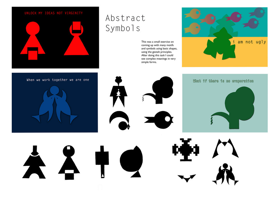
Abstract Symbols
- Look like the objects that represent but less details
Arbitrary Symbols
- No resemblance to the objects or ideas they represent
- WORD & IMAGE
- Important to use suitable and relevant images when designing
- Can deepen the meaning of the design based on the image
- Typography is arrangement of text to convey a message or concept
UNITED NATIONS' SUSTAINABLE DEVELOPMENT GOALS (UNSDG)
GOAL 14: Life Below Water
- Conserve and sustainably use the oceans, seas and marine resources for sustainable development
- Prevent and significantly reduce marine pollution of all kinds, in particular from land-based activities, including marine debris and nutrient pollution.
- End subsidies contributing to overfishing
Title : Life Below Water
Artist : Mr. Fijodor also known as Fijodor Benzo
Year : 2018
Material : Garbage
The design principles present :
- Symbol
- Harmony & Unity
- Balance (Asymmetrical)
Feedback
Week 2 - Add pictures for the notes
-Wrong principle used for artwork
Week 3 - Add material used for artwork, add links for the reference
Self-reflection
Further Reading







Comments
Post a Comment